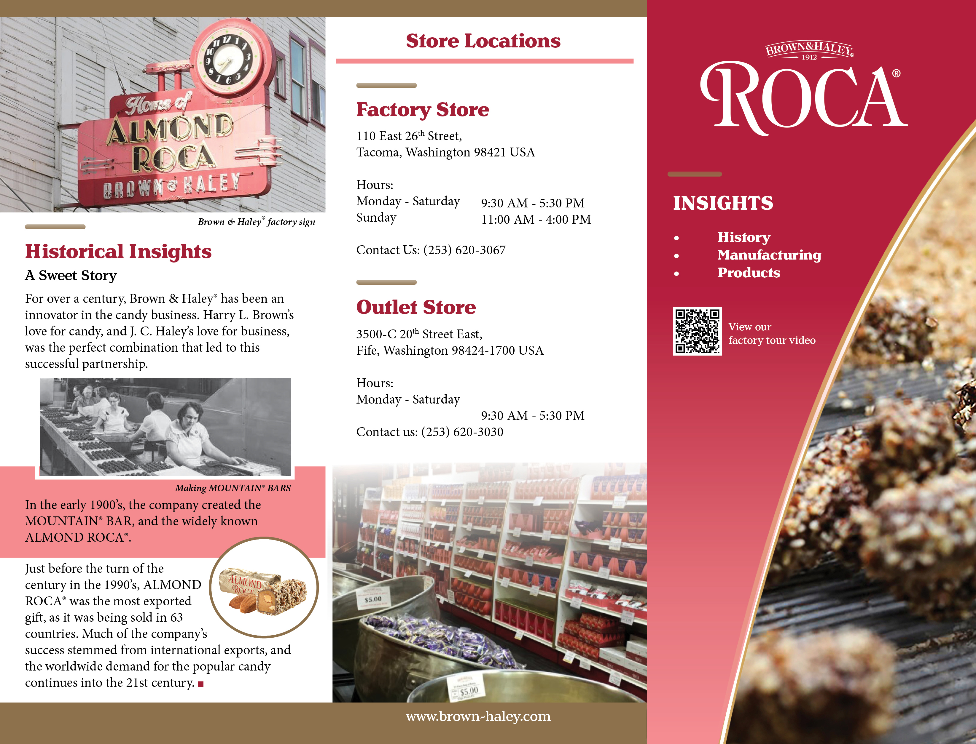
Brown & Haley®, commonly known as ROCA®, is a confection manufacturing company located in Tacoma, Washington. They have been in business since 1912. Their sweet creations, including the world-famous ALMOND ROCA® and MOUNTAIN® Bar, are distributed and sold in over 63 countries. Sharing their story with the community is important to them.
| Role | Time | Tools |
|---|---|---|
| Layout Design Photo Editing |
2 weeks | Adobe Indesign Adobe Photoshop |
The client needed a professional looking brochure that communicated the longevity of their business as well as the quality of the confections they manufacture. The client planned to print and fold the brochure in-house.
In the fall of 2021, I joined a team of two other students to complete this brochure project for my Design and Print Editing class at the University of Washington Tacoma.
My role was to gather the photos to be used and set the brand direction for the brochure. I designed the outside of the brochure and worked with my team to create a unified design throughout. To do this, I established the brand colors, chose the fonts, and created a type-scale to be used in InDesign.
The design goals were to communicate the history of Brown & Haley ® and to highlight key products. The audience of this brochure should be inspired to visit their two factory store locations, or their website, to learn more.
The brochure would be distributed at the Brown & Haley ® factory stores, local hotel gift shops, and at the Western Washington State Fair where they host the baking competition yearly. The audience of this brochure is demographically diverse.

Chen Li is visiting Tacoma for the first time. ALMOND ROCA® has been a special treat in his family for generations. The ALMOND ROCA® factory store is one of his tourist destinations.

Amanda Jonston and her son Caleb entered the parent-child baking contest at the Western Washington State fair. They received a brochure while waiting for the competition judging to begin.
Various brochure layouts were investigated for this project. These included a three-fold accordion style, a single fold pamphlet style brochure, and the classic two-fold “tri-fold” brochure.
My team wanted to choose a brochure style that would be easy to print and fold in-house by Brown & Haley® staff. We chose the two-fold brochure because it would be easy to fold and could be printed on standard size printer paper. The finished product is compact and fits into a standard size brochure holder, perfect for a counter-top display at the factory store or at the Western Washington State fair.

We began the design process with a wireframe of the brochure. This helped us as team to talk through design ideas and solidify a plan.
If we use brand colors and repetition, we can create unity throughout.
In this brochure design, we used ALMOND ROCA® Pink, Pantone 201C (red) and Pantone 873C (Metallic Gold).We also utilized shape and repetition; this can be seen in the use of circles and narrow rectangles on both the outside and the inside of the layout.

How might we tell the history
and production story of Brown & Haley?
To show the audience that this company offers a widely known candy that has been produced for over a century, we chose historical and factory production images, and wrote copy, to support the message.
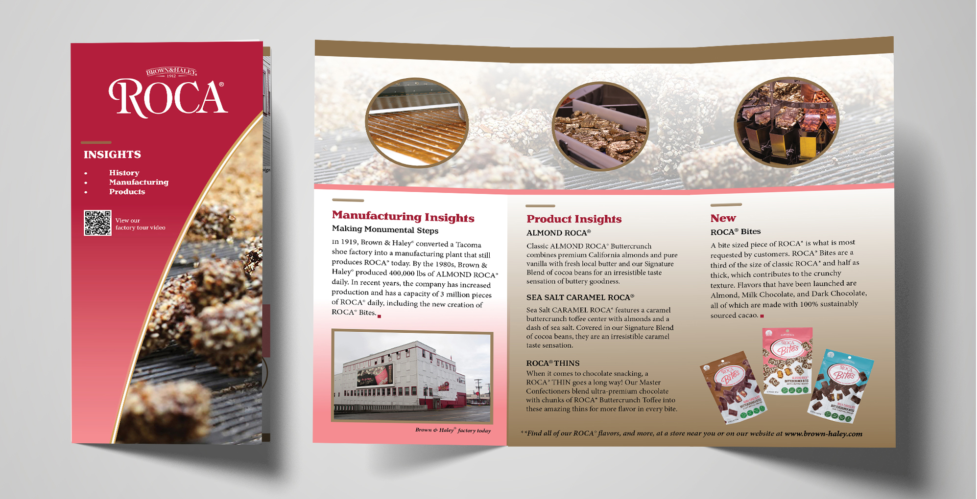
We chose to highlight ROCA® Thins and the new ROCA® Bites in the brochure to show that Brown & Haley® is innovative and continues to create new products while maintaining consistency. Additionally, the copy highlights a brief story of the Brown & Haley® history.
The brochure was designed with scanability in mind. It displays a strong brand message and informational hierarchy. Bold type and color were used to draw the eye through the design. Pictures were chosen that further explain the body content at a glance.