
Founded in 2000, the Healing Center is a Seattle area non-profit organization that exists to help people move through the grief process and heal after the loss of a loved one. The Healing Center was created as a safe harbor, a place where grief could be expressed openly and honestly in a caring and supportive environment. They offer support groups for all ages and stages of the grief process.
| Role | Time | Tools |
|---|---|---|
| Brand Design UI Design |
10 Weeks | Adobe Photoshop Sketch Invision |
The Healing Center had a list of goals for their redesign.
My role in the redesign.
A diverse group of individuals visit the Healing Center website. These include donors, clients, future clients, and volunteers.

Rachel is a Seattle area resident. She is married and a mother of two children. Her father passed away when she was in her early twenties. She wants to help others who are going through the same loss.

Jenna is in her early twenties. She recently lost her mother after a long battle with cancer. She wants to connect with other young adults who are grieving the loss of a parent.
I began the redesign process by researching the sites that the Healing Center staff said that they liked. I looked for common traits in these sites and found that they had similarities such as large hero images and clear information hierarchy created through the use of typography information grouping.
I researched colors and learned that colors can affect our emotions. I learned that orange is the color of encouragement, yellow is the color of optimism, green is the color of renewal and life, blue is the color of trust and rose is the color of nurturing. I used my research in redesigning the healing center logo.
If the brand colors reflect the supportive environment of the Healing Center, readers are more likely to stay on the website longer to learn more about the non-profit and their offerings.
I created a new logo based on my color research. The new logo incorporates the characteristics of the Healing Center through the use of color.
The logo consists of a rose heart to symbolize the nurturing care of the Healing Center staff, the frame of a house in green to represent the renewal found in the Healing Center environment, an orange square is shown behind the house spreading out to the right, to represent the encouragement and optimism found in the Healing Center environment that spreads outward into the community. Lastly the Healing Center logo-type is the foundation of the design. It rests at the bottom of the design and is shown in blue to represent the trustworthy nature of the center.
If the content was organized so that it was easy to understand and navigate, clients are more likely to use the website to find information, sign-up for groups and donate.
I printed out the pages of the current website. I cut them up and re-organized similar information and eliminated redundant information. Keeping my user personas in mind, I created a user flow and site map.
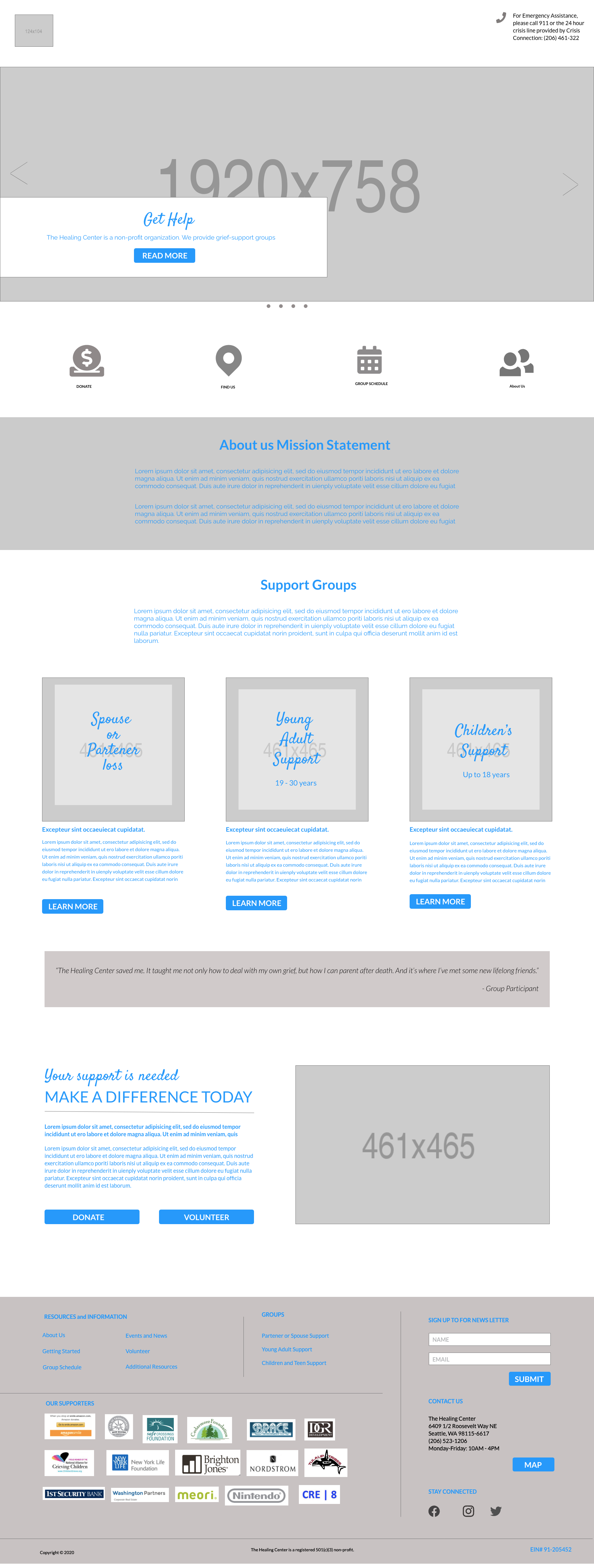
Once this information was in place, I began my design work. My goal was to give the healing center staff four template pages that they could use for their new site. They wanted a site they could update easily on their own, so kept this in mind when creating the template pages.
I created wireframes for all four pages in both web and mobile.

Design extention created to inform and guide the style of the redesigned website.

Moadboard created to establish the look and feel of the redesigned website.

Redesigned homepage hero and navigation.
The Healing Center is such a vital resource for the community, and I was excited to work on this project because I wanted to help them reach their audience with a professional looking website and easy to find information to better serve their customers and volunteers. My design solution met the goals of the Healing Center design brief.
Given the opportunity to revise this design, I would make the following changes: I would reduce the number of grim looking portrait images and I would add an accent color that is brighter to draw attention to the call-to-action buttons.

